Table of Contents
Welcome to our guide to pivot tables, this guide was a request by a follower, feel free to make a similar request if there is a topic you would like a guide on.
What are pivot tables?
A pivot table allows you to view data like a ‘pick and mix. It enables you to easily select data using different headings from your main data table and place the data in rows or columns. You can then also filter. Changing the layout of a pivot table is far quicker than setting up new spreadsheets each time and without the need to change the raw data. You can also keep creating new pivot tables with differing layouts from the same data.
What does the pivot mean?
The “pivot” in the pivot table just means that you can move the data around to change how you see it. This is what allows you to sort and organize the data.
How to make our own pivot table
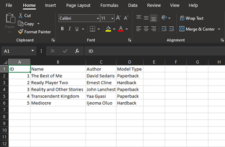
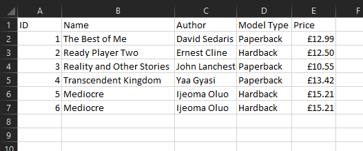
To make our table we will first need some data to work on, you can use your own or the provided set of data of some of the top books in 2020.
Download our practice sheet here.
You are advised to check file integrity before opening, this can be done by uploading the file to VirusTotal and checking the returned hash matches the below a7486b3dc0cd5506a2a7343c518655ff37e21441a369b61f01b1e98693ebaf76 or by using your own software to scan the file.
With the data added to excel it should look like the below.
Our next step is to insert a pivot table. Click on the data in the table or select the entire table. Next click on the Insert Tab, click PivotTable.
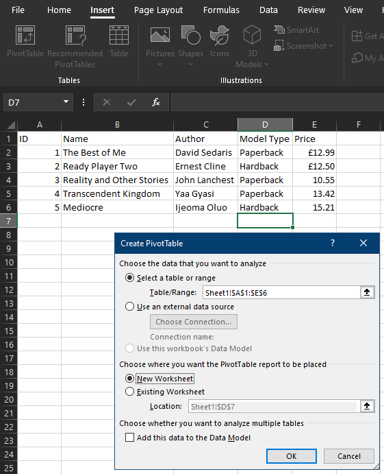
With this pop-up, you can change the data, but by default, it should automatically select the entire table, so just click Ok.
Upon clicking Ok the screen will update. Do not worry, you have not lost your data, you will notice that you are now working on a separate sheet. You should also see the PivotTable Fields display.
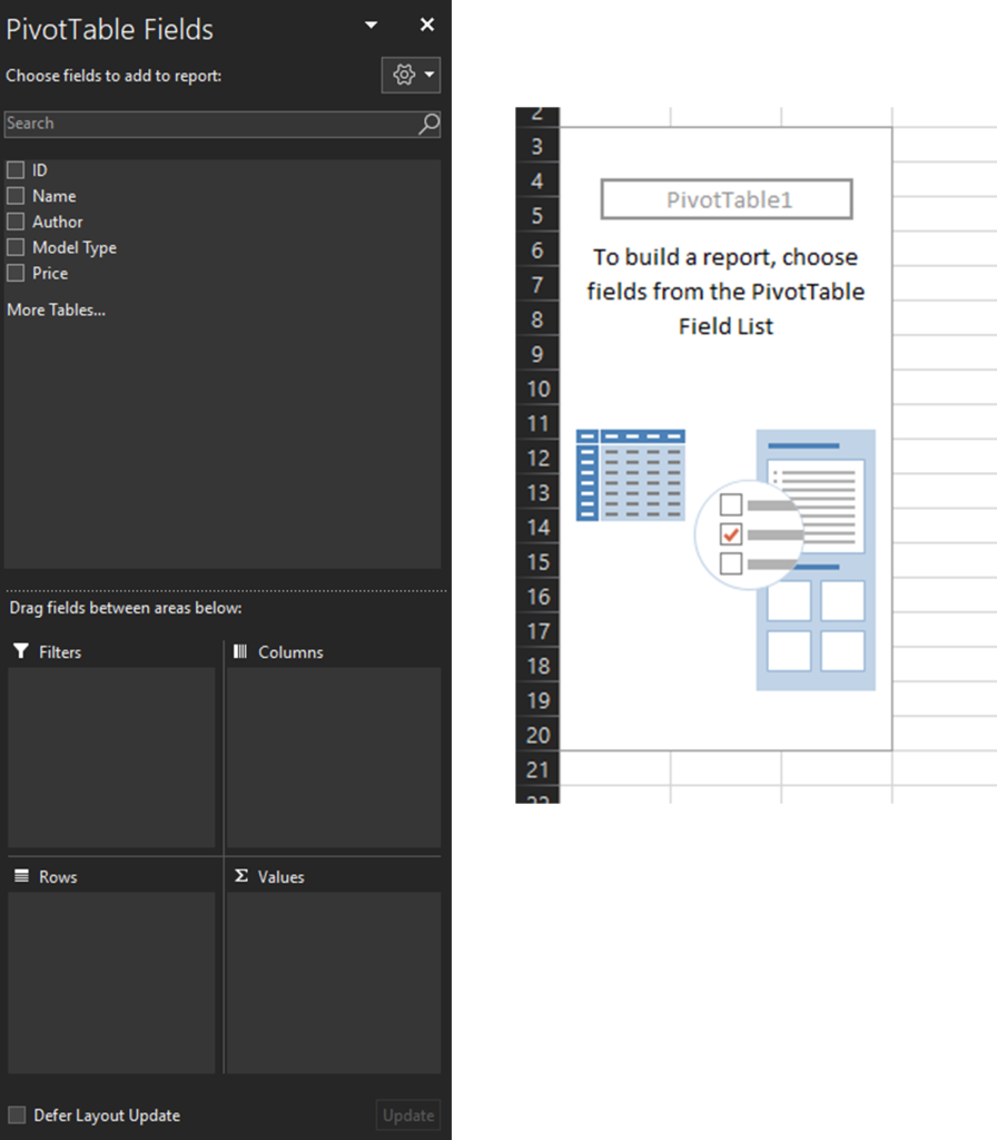
This may look confusing or scary but don’t worry, we will go through it.
PivotTable Fields
At the top we have our column headers from the table we created, now we can drag these to the boxes below to reorganize our pivot table.
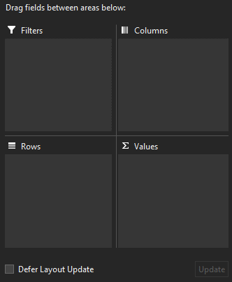
The four boxes will change the display of our table, to understand what will change we need to know what each box does.
Rows
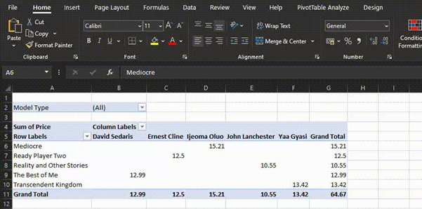
The field you place in rows will most commonly be the data you want to stay present on the screen. In my case I wanted to work with all the books based on their names, which means I put “Name” in the Rows box.
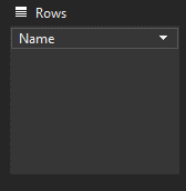
To add data to boxes, you can either click or drag the field into a box, I prefer to drag as it offers more control.
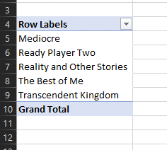
With “Name” now added we can see that the table has been updated to show our book names.
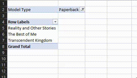
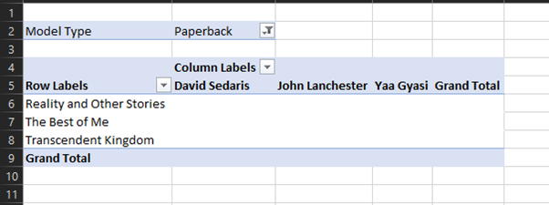
Filters
This box as the name suggests will filter our data based on the item we place inside of it. If we happened to place “Model” inside, we would now have a filter that can either be “Hardback” or “Paperback”. Below is an example of me filtering the books.
Columns
Columns are where we can place a field to have it displayed across the top of our table. Using “Author” now we can provide more helpful data to our table. This would result in our author’s names shown across the top.
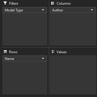
Values
In the values column we can have excel display data within the table we have now made. Excel will also automatically sum any data that appears more than once within our set filters. (Example further below)
Naturally, with these being books, the clear choice to display is the price. Go ahead now and drag “Price” to the Values box and see what happens.
You should have something that now looks like this.
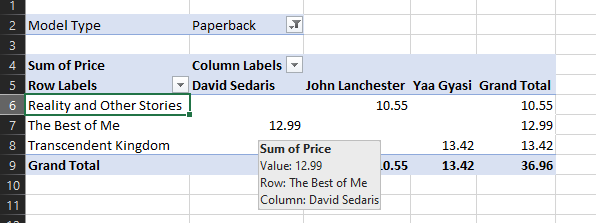
Not only is our table now showing us the price of each book, but it has also given us the grand total for all our books that are paperbacks (Remember that we set a filter). Now try playing around with the filter. You should see that setting it to all or hardbacks will automatically pull the correct data and display it clearly for you to see.
Feel free to play around and change what is in each box to see what happens, the best way to learn is to practice using a test dataset like this. Very soon you will find yourself an expert at pivot tables.
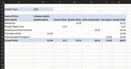
Summing Data
As we mentioned above, excel will also automatically sum any data that appears more than once. This can be especially helpful in large datasets where things with the same name need to be totaled together.
To try this out we are going to go back to our original table, you can do this by clicking onto the other excel sheet. Next, we are going to duplicate the item on the bottom row, your data should now look like the following.
We now need to update our pivot table to see this new data.
Back on the pivot table sheet, Click on your table, and then click PivotTable Analyze, Change Data Source.
Have you noticed the change?
If you said the Grand Total has increased, well done. The pivot table has detected that we have two of the same book and has added their prices together to show this.
PivotTable Charts
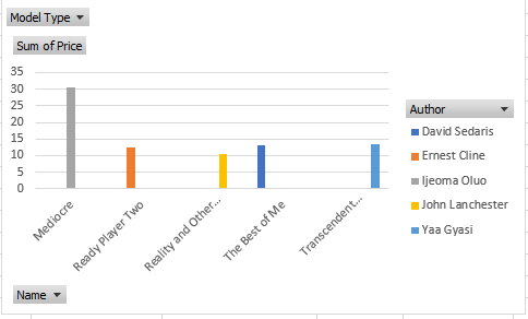
We will now very quickly look at Pivot Table charts, these charts will mimic our filters/rows/columns and prices in their display and as a result, make it very easy to show clear relationships in data.
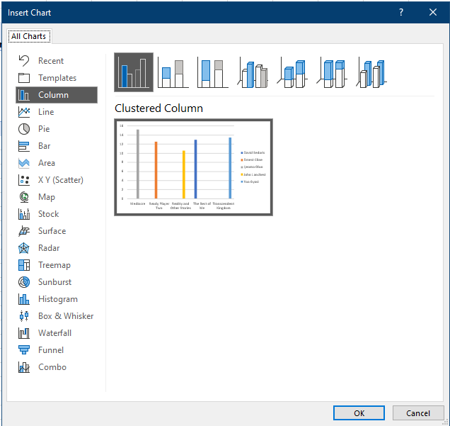
To make a chart using the data, once again Click on your PivotTable and then go to PivotTable Analyze and finally PivotChart. PivotChart will automatically tell you what tables are possible based on the data we have entered. We are going to select Column and Clustered Column for our table.
Press OK and there we have it, a nicely displayed table showing off all of our products and their prices based on the filter settings.
To progress further, try changing the filters or repeat the guide with your own set of data.